
Custom OEM Metal Pens Manufacturer & Global Supplier
Custom OEM Metal Pens Manufacturer & Global Supplier
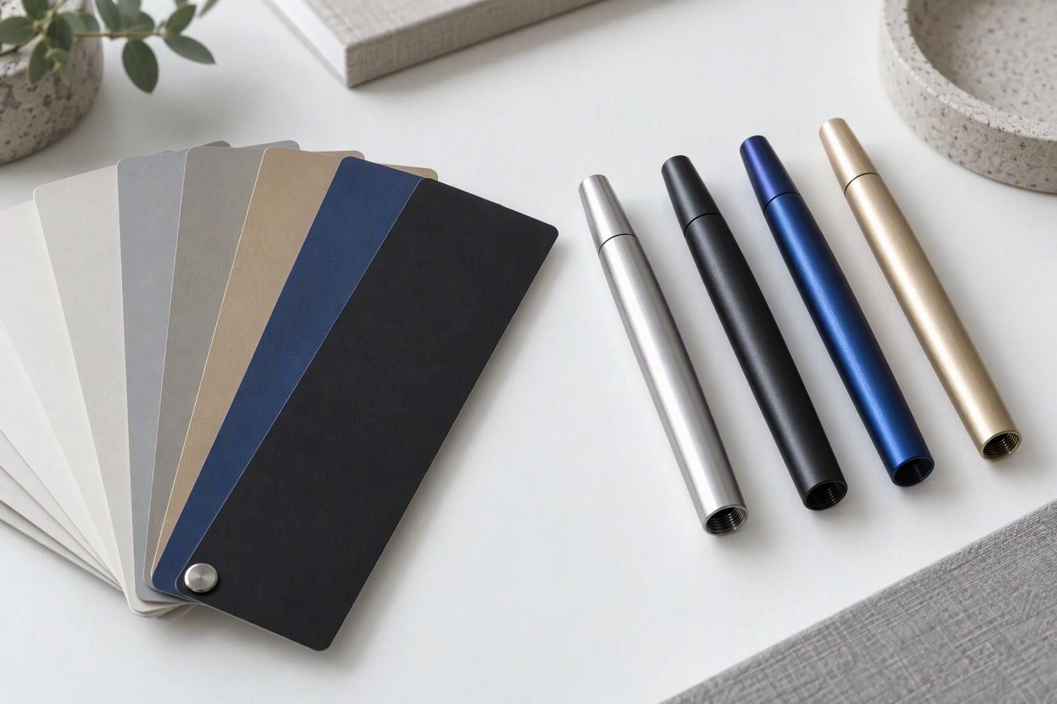
A Pantone reference is a promise made on paper: a specific spot ink on white coated stock, judged under a specified light, exact only inside that system. The moment the same colour lands on a metal pen it becomes a target you approach rather than a value you reproduce, because the surface underneath is no longer white paper — it is brass, aluminium or stainless steel, and it has a vote in the outcome.
Treat the code as an exact match and you will find a difference on the first sample, decide the factory got it wrong, and start a dispute neither side can settle on paper. Understand what physically changes between card and pen and you know which differences are expected, which are controllable, and which belong in the sample approval.
Below: the four physical reasons the same Pantone reads differently on different surfaces, the two colour-matching jobs buyers conflate, what a delta-E tolerance means, and the three ways to handle colour approval.
The gap between the card and the pen comes from four physical causes. They compound — a real pen usually has all four at once — but separating them lets you diagnose a specific mismatch instead of arguing about the whole pen. Each has a different fix.
A Pantone swatch is printed on white coated stock, which reflects light broadly and evenly, so almost everything your eye receives is light that interacted with the ink itself. The stock is a neutral stage; metal is not: brass has a warm, yellowish cast, aluminium a neutral to slightly cool grey, stainless steel a little cooler and bluer. Light that passes through the coating, reflects off the substrate and returns does so tinted — and in pale tints (soft greys, light blues, warm off-whites) that contribution is a visible part of the reading. The same pale coating over brass picks up warmth; over aluminium it reads cooler and a touch greyer. Darker, heavily pigmented coatings block more of the substrate, so the effect shrinks but does not vanish: our comparison of brass, aluminium and stainless steel is worth reading before the colour is chosen.
Gloss level changes the perceived lightness and saturation of a colour at the same pigment load. On a high-gloss surface, light reflects directionally, so more of the light reaching your eye made a single short pass through the coating and the reading stays close to the pigment’s intrinsic value. A matte surface scatters light; more of the light has travelled through the film more than once, deepening perceived saturation while the diffuse reflection lifts apparent lightness. The identical coating sprayed matte therefore usually reads lighter and less saturated than the same coating sprayed to gloss — and because a Pantone card is itself a semi-gloss stock, a matte pen tends to disappoint even when the formulation is right. Check the gloss level before you blame the colour match, and name it in the specification; our surface finishes article covers the options.
Industrial colour on metal arrives in passes: spray and lacquer build a film coat by coat, and anodising grows a coloured oxide layer outward from the metal. Below full coverage the substrate shows through; above it, the coating’s own colour dominates. That threshold is where matching happens, and it is process-specific — one spray line’s film build is not identical to another’s. This is the mechanism behind “one more pass changes the colour”: a slightly under-covered coating reads closer to the substrate, warmer over brass and duller over stainless, and at full coverage it reads as itself. Metallic and pearl pigments make the effect loudest — those reflective flakes need enough film build to lie flat and aligned, and a film too thin leaves them tilted, shifting lightness and changing the sparkle rather than the hue.
Colour is not a property of the pen alone; it is the combined result of light source, surface and observer, and the Pantone system’s own tools are built around standardised light sources and a standard observer. Your office is unlikely to be one: office LEDs are cool and narrow in their spectral balance and shift warm mid-tones differently from daylight, and viewing angle compounds it — a glossy barrel throws a hard highlight at one angle and deep shadow at another. Two honest people can look at the same pen under two different lights and disagree, so before treating a mismatch as a defect, compare under daylight and under your intended display light. If the reading moves between them, what you have is a viewing-condition question, and the fix is a stated light source in the approval.
Check which Pantone reference you were actually given. Formula Guide-style spot-ink swatches are formulations — a specific ink mix on a specific stock — which a factory can be asked to match. A value quoted from a CMYK bridge, read off a screen in RGB, or pulled out of a PDF is a simulation of the target, not the target itself. Quote the Pantone code, not the screen value.
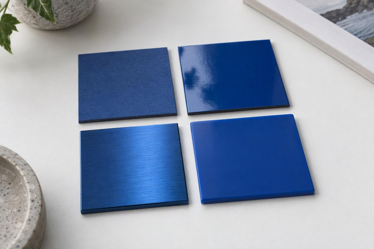
The table below describes how a typical mid-tone brand colour tends to behave on four common surfaces. The expectations describe the direction of shift — what tends to happen, and why — not a numeric tolerance, and they follow from the physics of each process. The tolerance that governs your batch is the one agreed against a retained physical swatch.
| Substrate | What happens to the colour | What to watch for | Realistic expectation |
|---|---|---|---|
| Printed paper (coated stock) | The reference itself: a specified spot ink printed on neutral white stock, with no substrate contribution and no film-build question. | Whether the reference is a spot-ink swatch, a CMYK bridge print or a screen value — only the swatch is a formulation a factory can match. | The starting point of the conversation, not the endpoint. The pen will not reproduce it; the process will approach it. |
| Anodised aluminium | Colour is grown into an oxide layer on the metal rather than sitting on top of it, so the reading stays fairly even across the surface and across viewing angles. | Shade range: some very saturated brights and deep tones sit at the edge of what the dye chemistry reaches comfortably, and achievable shade can differ between suppliers. | Mid-tones track the target in direction; very light tints can read slightly deeper or cooler than over paper. Judge from a swatch, not a rule. |
| Sprayed brass or stainless | A lacquer film is built in passes over the prepared metal. Thin or semi-opaque layers let the substrate contribute; at full coverage the coating reads as itself. | Film build and coverage: under-covered areas pick up substrate warmth, and matte gloss reads lighter and less saturated than high gloss. | A broad shade range, including most mid-tones and many deep tones. Pales and metallic pigments need the film build confirmed on a swatch on the actual metal. |
| Plated finish | Plating is itself a metallic, highly reflective layer, and a coloured lacquer over it can read more electric than the same coating over matte bare metal. | Edge coverage and adhesion at the plating interface, and how the plating’s own brightness shifts perceived lightness. | Directionally matchable, but the base reflectivity is part of the reading. Verify on the actual plated substrate before treating the colour as agreed. |
Read the right-hand column as physics, not as a promise. These are the tendencies of each process — the direction a colour tends to move — never a numeric delta for your order. Your order’s tolerance is whatever is written into the sample approval against a retained swatch; that document, not this table, is what a batch is judged against.
When a buyer writes “Pantone match” in a specification, a factory reads one of two different jobs. They share a word and almost nothing else: different materials, different processes, different achievable tolerances.
Matching a printed logo colour
- Matched as an ink formulation — the pigment mix is tuned to a target and applied by pad or screen printing over a defined base.
- Usually the closer of the two, because the ink is concentrated and the surface under it (the already-approved body) is a known, fixed substrate.
- The failure mode is coverage and opacity — pinholes or a mismatched second pass — not the substrate showing through.
- If the logo is laser engraved or stamped there is no ink and no colour to match: the “colour” is the metal itself — see our logo decoration methods article.
Matching the body colour
- Matched as a coating or anodising chemistry spread across an entire substrate and every part of the pen.
- The reference is a printed card and the substrate contributes, so the achievable closeness depends on metal, finish and film build.
- Every part — cap, barrel, clip, grip — must match each other as well as the target, and different shapes catch light differently.
- The failure modes are film build, gloss drift and substrate show-through, not ink formulation.
The fix is a sentence, not a negotiation. Write the specification as two lines — “body in Pantone X, anodised aluminium, semi-gloss” and “logo printed in Pantone Y” — and state the decoration method. If the logo is engraved or stamped, say so explicitly, because “printed Pantone” on an engraved logo is a contradiction that will otherwise surface at sampling. Our logo artwork checklist covers the file side.
ΔE (delta-E) is a single number describing how far apart two colours are to a standard observer. Lower is closer: zero means identical under the measurement conditions, and larger values mean a bigger visible difference. It is produced by measurement — typically a spectrophotometer that reads a surface numerically instead of relying on anyone’s eyes.
An agreed ΔE tolerance is therefore far more useful contract language than the words “Pantone match”, which cannot be failed or passed. “Measured against the retained swatch, under the light source stated in the approval, within ΔE as agreed for this order” is a term both sides can test, report on and settle — it turns opinion into a number on a report, and a report is something a factory can work to and a buyer can check.
What the number should be is a question for your supplier, not an assumption to import. Different processes support different achievable tolerances, and the honest answer is the tolerance a factory can actually hold on the specific finish that will build your pen. Ask “what ΔE tolerance do you work to on this finish, measured how, and under which light source?” — and treat the answer as a term to agree in writing. How a supplier answers is itself a vetting signal: our manufacturer vetting guide covers what to listen for.
A word about borrowed thresholds. You will find specific ΔE pass/fail numbers online presented as “the industry standard”. Different industries use different tolerances for different purposes, and a figure from commercial print or plastics packaging does not automatically transfer to a hand-held metal pen. Treat any threshold you did not agree with your own supplier — in writing, for your process — as marketing rather than specification.
Colour approval done properly is three moves. Each is cheap, and each removes a specific, predictable failure mode.
Be realistic about what any of this can deliver. No metal pen will be a delta-zero Pantone match on every unit in a batch — not on spray, not on anodising, not on any process we are aware of. Some spread within a batch is normal: film build varies across a run, and a production batch will not be as uniform as a hand-finished swatch. The useful contract language is therefore an agreed tolerance against a retained physical swatch — measured, with the light source stated — rather than the word “exact”. “Exact” is a promise no factory can certify and every buyer should distrust; a written tolerance is a term both sides can meet. If a supplier offers you a delta-zero match, ask how it is measured and what happens to the units that fall outside it.
Most, within the limits of the process. Anodising, spray lacquer and pad or screen inks each have shades they reach comfortably and shades at the edge of their range. The honest answer for a specific code comes after we know the metal, the finish and the decoration method — ask for a swatch on your substrate and you will see the achievable outcome before you commit.
Almost always one of the four reasons above: the substrate under the colour, the gloss level, film build, or the light you are viewing under. Check the gloss first, then the light source. If it still reads wrong against a retained swatch under a stated light, that is a legitimate conversation to have with the factory, measurement in hand.
A swatch is a physical sample of the colour applied to the actual substrate and finish of your order — sprayed, anodised or printed — rather than a printed card. Sampling is quoted separately from production, and how the sample charge is handled against an order should be confirmed in writing. Swatches cost a fraction of a wrong production run and turn a colour argument into a physical object.
Measure rather than argue: compare the batch against the retained swatch under the light source named in the approval. A small spread within a batch is normal and covered by the tolerance you agreed. If the batch sits outside the agreed tolerance against the named swatch under the named light, that is a non-conformance to raise formally — and our article on AQL sampling and inspection describes how acceptance works.
It behaves differently rather than simply better. Anodised colour is grown into the oxide layer rather than sitting on top of it, so it is not prone to chipping off the way a lacquer film can, and anodised finishes are generally more resistant to wear. Spray covers a broader range of shades and can usually be tuned more loosely to an unusual target. Which suits you depends on the colour, the gloss and the use — judge from swatches, not from a general rule.
Tell us the brand colour, the substrate you have in mind and the decoration method. We will quote swatches on the actual metal and finish, state the light source we will approve under, and tell you plainly what the achievable outcome is before you commit to a production run.
