
Custom OEM Metal Pens Manufacturer & Global Supplier
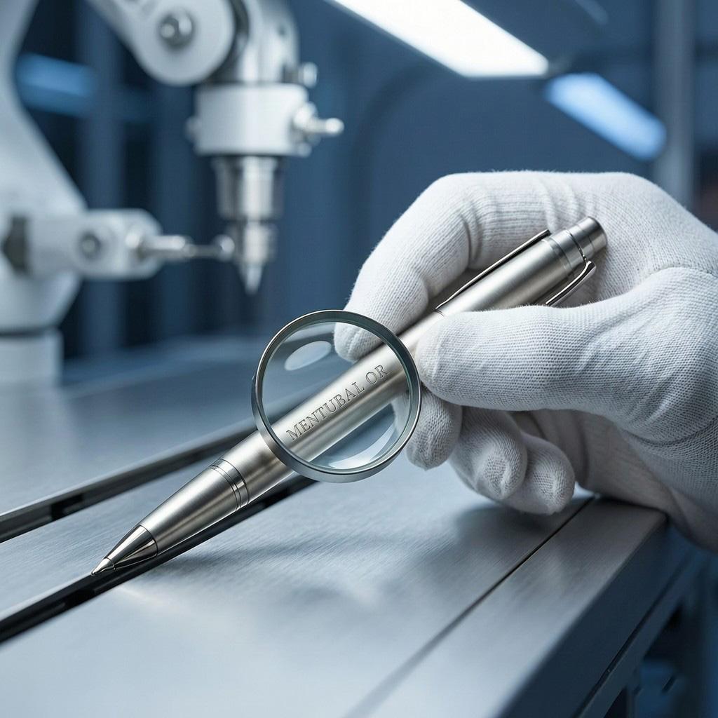
Almost every delayed pen order traces back to the same place: artwork that arrived in a form the production process cannot use. Not a bad logo — a good logo in the wrong file. It costs a week of redrawing, a second proof cycle, and sometimes a penalty on the delivery date.
The good news is that nearly all of it is avoidable with five minutes of checking before you hit send. This is the pre-flight checklist we wish every buyer ran, written out in full so you can hand it to whoever prepares your files.
If any box is unticked, the proof will come back with a query, and that query costs calendar days.
| Format | Usable for | Verdict |
|---|---|---|
| AI / EPS | Engraving, screen, pad, UV — everything | Best. Editable vector paths. |
| PDF (vector) | Everything, if paths are intact | Good — confirm it is not a flattened raster. |
| SVG | Everything, increasingly common | Good. Check text is outlined. |
| High-res TIFF / PNG | UV printing only | Acceptable at 300 dpi or above at final size. Not for engraving. |
| JPEG | Nothing | Compression artefacts. Avoid. |
| Word / PowerPoint / screenshot | Nothing | The single most common cause of redraws. |
The reason vector matters is mechanical as much as aesthetic. A laser follows paths; a screen is burned from a vector separation. A raster image has no paths to follow, so it has to be traced — and an auto-traced logo rarely matches the original cleanly.
Convert all text to outlines. This is the rule that causes the most avoidable delay. If your file contains live text set in a font the supplier does not have, their software substitutes something else, and the proof comes back with the wrong typeface — or with an error and no proof at all.
Then check the size. Small text is where logos fail on a pen, because a pen barrel offers far less height than a business card.
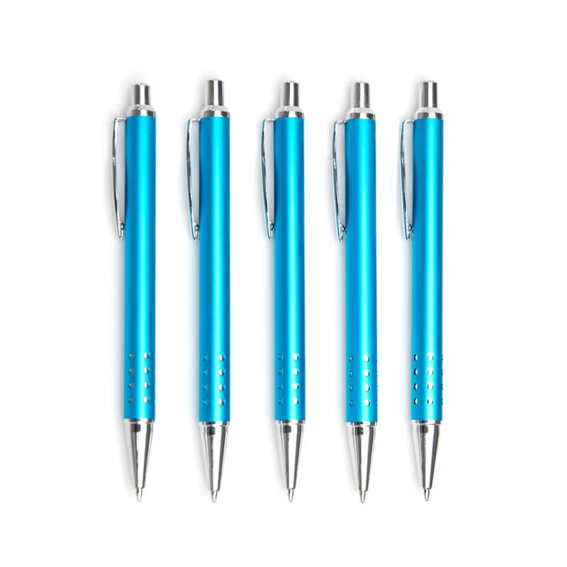
A logo can be the right size overall and still fail because individual strokes are too thin, or because two elements sit too close together and merge once applied. Both are fixable in the artwork, and neither is fixable on the barrel.
A logo can be the right size overall and still fail because individual strokes are too thin, or because two elements sit too close together and merge once applied. Both are fixable in the artwork, and neither is fixable on the barrel.
| Method | Minimum stroke weight | Minimum text height | Clear space between elements | What happens if you go below |
|---|---|---|---|---|
| Laser engraving | 0.10 mm | 3–4 pt (about 1.1–1.4 mm cap height) | ≥ 0.10 mm | Strokes break up; small text fills in and becomes unreadable |
| Etching (acid) | 0.15 mm | 4 pt (about 1.4 mm cap height) | ≥ 0.15 mm | Etch bites unevenly across thin areas; letters lose their centres |
| Screen printing | 0.20 mm | 5–6 pt (about 1.8–2.1 mm cap height) | ≥ 0.20 mm | Ink bleeds under the mesh; fine serifs close up and disappear |
| UV printing | 0.15 mm | 4–5 pt (about 1.4–1.8 mm cap height) | ≥ 0.15 mm | Edges soften; very small counters fill with ink |
| Pad printing | 0.20 mm | 5 pt (about 1.8 mm cap height) | ≥ 0.20 mm | Ink distorts on the silicone pad; thin lines thicken unevenly |
| Embossing / debossing | 0.30 mm | 6 pt (about 2.1 mm cap height) | ≥ 0.30 mm | Detail collapses under pressure; dies wear out faster |
Rule of thumb. Keep the clear space between two adjacent elements at least equal to the minimum stroke width of the method you have chosen. If in doubt, send your vector file and ask the supplier to mark up any lines that are too thin — a five-minute review costs nothing and saves a sample round-trip.
For printed artwork, supply Pantone references with the coated “C” suffix — not CMYK values, not RGB, and not a colour picked off a screen. Screen printing and UV printing match to Pantone standards, and a screen colour is not a specification.
Engraving has no colour to specify. It removes the surface to expose the base metal, so the mark takes the metal’s tone. What you can specify is contrast — and contrast depends on the barrel finish. Engraving on brass gives a warm metallic contrast, on matte black a subtle silver-grey, and on a mirror-polished surface it can nearly disappear. If you want a mirror barrel, ask for a deeper pass and confirm on a sample.
One more expectation to set: metal shifts perceived colour. A Pantone match on a brushed silver barrel will not look identical to the same ink on white paper. If colour accuracy is critical, request a printed sample before approving production.
These limits interact with your choice of method. Engraving is single-tone; multi-colour artwork needs printing. If you have not settled that question yet, start with our comparison of laser engraving, screen printing and UV printing, and see how branding choices affect unit cost.
Before you approve, the proof should let you answer four questions without asking anyone:
If the proof does not answer one of those, ask before approving. Approval is the point at which a cheap correction becomes an expensive one.
Individual names, employee numbers or sequential serials on each pen are increasingly common for recognition programmes and onboarding kits. The artwork rules are the same, but the delivery is different, and getting it wrong wastes the whole batch.
Personalised orders cannot be reworked. Once a name is engraved, the unit is unsellable to anyone else. This makes the pre-production sample more important than usual — approve it carefully, and check the spelling on the sample itself rather than in the data file.
Most artwork problems come from a designer working to print or screen conventions, where space is effectively unlimited and stroke weight is free. A short brief prevents it. Give them four numbers:
Then ask for one deliverable change: supply the logo in a single-tone version as well as the full-colour one. If the programme ends up engraved, you already have the right file, and you avoid the most common last-minute scramble.
A vector file — AI, EPS or PDF with editable paths, with all text converted to outlines. The laser follows vector paths, so a raster file has to be traced first, and tracing rarely reproduces the logo cleanly.
Around 4 pt for laser engraving is the practical floor; below 3 pt the marks begin to merge. Screen printing needs slightly more, around 5–6 pt, with heavier strokes. Always confirm on a physical sample.
For UV printing, yes at 300 dpi or above at final print size. For laser engraving, no — engraving requires vector paths. When in doubt, send vector.
Pens are colour-matched to Pantone standards. CMYK values have to be converted to a spot colour, and that conversion introduces a guess. Give us the coated “C” reference and the match is exact.
A standard barrel gives roughly 30–50 mm of printable width and 5–8 mm of height. Design to that box and state the placement in your brief — a second logo position is a second setup and adds cost.
Email your logo file, target quantity and preferred barrel. We will confirm whether it engraves or prints cleanly, flag any artwork problems up front, and quote both methods so you can compare. Specification-based quotes returned within 24 hours.
